A Brand Development Case Study
The Challenge
When I approached my personal brand development for topher.codes, I faced a unique set of challenges. As someone with over 20 years in ministry and a parallel 20-year journey through the tech industry, I needed an identity that could authentically bridge these seemingly disparate worlds.
My goals were threefold:
- Create a visual identity that represented both my technical expertise and my deeper purpose
- Design a mark that would work equally well in corporate tech environments and more personal contexts
- Tell a story of transformation that reflected my own career journey and philosophy
This wasn’t just about a logo—it was about creating a visual language that could communicate my unique value proposition: the rare ability to translate complex technical concepts into human terms, while bringing meaning and purpose to digital solutions.
Design Philosophy
I’ve always felt a kinship with penguins. Beyond their charming appearance, these remarkable creatures embody qualities that resonate deeply with my professional approach:
- Adaptability: Thriving in harsh environments, seamlessly transitioning between land and sea much as I navigate between technical and non-technical domains
- Community: Building and maintaining strong social bonds, taking turns supporting each other through challenges
- Devotion: Mating for life and demonstrating extraordinary commitment to finding the perfect pebble gift—showing that attention to detail and dedication matter
- Nurturing Leadership: Father penguins caring for eggs through freezing conditions, demonstrating that true leadership often means protecting what’s valuable through difficult times
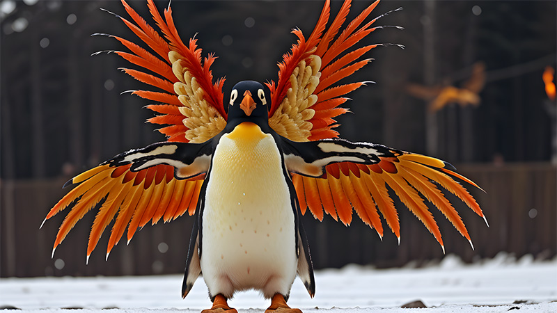
Yet I also wanted to capture the transformative aspect of my journey. This is where the phoenix metaphor emerged—a powerful symbol of:
- Transformation: Rising renewed from challenges
- Unique Potential: Discovering hidden capabilities
- Legacy: Creating something that endures
The question became: how could I combine these symbols in a way that was elegant, professional, and meaningful without being overwrought? In short, how to combine fire and ice?
Evolution Process
Initial Concepts
Through the use of various AI technologies and digital design platforms, I began with separate explorations of penguin and phoenix imagery, but quickly realized that literal representations would be too complex and potentially too playful for a professional tech brand. Instead, I needed something more subtle and sophisticated.
| Digital Art Image | Photo-Realistic Image | Pixar Type Image |
|---|---|---|
 |  |  |
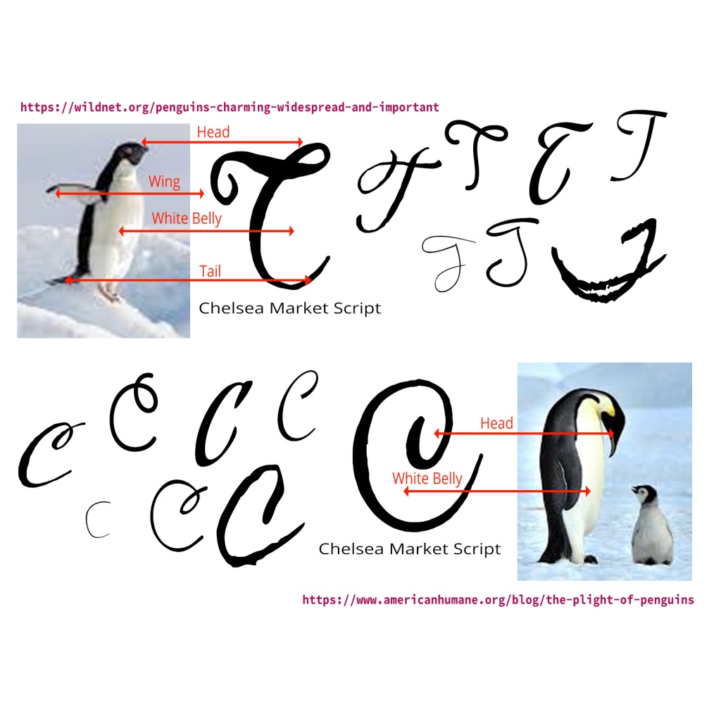
My breakthrough came when I started experimenting with letterforms. What if the ‘T’ in Topher could incorporate both penguin and phoenix elements through clever use of negative space and flowing lines?

Technical Execution
Working in Photoshop, I explored how a calligraphic ‘T’ could form the basis of my design. I wanted something with:
- Clean, precise lines for technical credibility
- Flowing, organic curves for human connection
- Strategic negative space for hidden meaning
By carefully crafting the curves of the letterform, I discovered I could create a penguin’s head in the upper portion of the ‘T’ while the crossbar could transform into a phoenix wing. Additionally, I found that the flowing nature of the design naturally created a ‘C’ that complemented the ‘T’—creating a perfect monogram for my brand.
The gradient for the phoenix elements—transitioning from vibrant yellow to deep red—was carefully chosen to suggest the transformation process itself: from spark to flame.
Refinement
The final design went through multiple iterations, balancing several considerations:
- Maintaining legibility at different scales
- Ensuring the “hidden” elements were discoverable but not distracting
- Creating a mark that worked in both color and monochrome
- Developing a visual system that could extend beyond just the logo
Hidden Elements
What appears at first glance to be a stylized ‘T’ contains several layers of meaning:
- The Penguin: Look closely at the upper curve of the ‘T’ and you’ll see a penguin’s head, complete with an eye and beak. With careful observation, you’ll also notice this forms an “E” for “Ember”
- The Phoenix: The feathered extensions represent phoenix wings, suggesting transformation and rebirth
- The TC Monogram: The flowing line creates both a ‘T’ and a ‘C’, representing “topher.codes” with the
- The Gradient: The color transition symbolizes the transformation journey itself
Technical Specifications
For fellow design enthusiasts, the technical details:
- Primary colors: Deep black (#2d3436) with phoenix gradient from yellow (#ffd666) to orange (#ff9f43) to red (#ff7675)
- Typography: Custom calligraphic letterforms for the logo, complemented by clean sans-serif for supporting text
- Scaling: Designed as vector graphics to maintain integrity at any size
- Formats: Available in SVG, PNG, and PDF to serve all contexts
The Birth of Ember
Through this design process, a character emerged—Ember, the penguin with phoenix potential. The name wasn’t my first choice; I considered several options including Frostfire (unique but perhaps too fantasy-oriented), Spark (energetic but suggested only beginnings), Phoenix/P.N.X. (clever but needed explanation), Codeburn (memorable but already in use elsewhere), and Echo/Resonance (suggesting amplification).
Ultimately, “Ember” captured the perfect balance – suggesting transformation in progress, neither just a spark nor a full flame, but something with both potential and present warmth. More than just a mascot, Ember represents the journey of transformation that characterizes both my work and my approach to helping clients.
In the system architecture of topher.codes, Ember takes on a personality of their own:
- Loading screens: “Ember is warming up the servers…”
- Form submissions: “Ember is delivering your message!”
- Error messages: “Oops! Ember slipped on some ice. Let’s try again.”
- Success notifications: “Ember’s wings are on fire! Great job!”
When entering more complex technical operations, the system might note: “Ember is entering the Penguin Nexus…” with the status indicator “PNX processing…” This PNX acronym cleverly serves double duty – standing for both “Penguin Nexus” and as a shorthand for “Phoenix.”
The Story Behind the Story
This logo is more than a visual identifier—it’s a personal manifesto. It represents my belief that we are all capable of transformation while staying true to our core selves. Just as a penguin might dream of soaring like a phoenix, I believe in helping technical solutions transcend pure functionality to create meaningful human impact.
The tagline that accompanies the logo—”Where Ideas Ignite Beyond Expectations”—captures this philosophy. It’s about taking what’s expected (like a penguin) and discovering the extraordinary hidden potential within (the phoenix).
In my work as a Solutions Engineer, this perspective allows me to bridge technical implementation with human needs, creating solutions that surprise and delight while delivering rock-solid functionality.
After all, who says a penguin can’t catch fire?

0 Comments